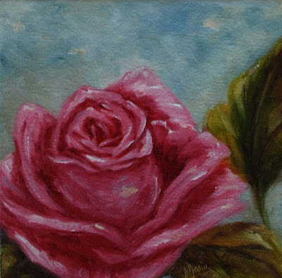
I love painting the same subject multiple times to study how different they turn out. I find it very interesting how using different painting surfaces will result in such a different look.
"Pink Rose #1"
6 x 6 - oils on canvas panel
This first rose was painted on canvas panel, notice the coarser textured background.
For the rose I used combinations of alizarin crimson, transparent oxide red medium, permanent rose, burnt umber and white. The background was mixes of ultramarine blue, sap green and white. For the greens I used sap green, dioxide purple, indian yellow, cad yellow light, burnt umber and white.
"Pink Rose #2"
6 x 6 - oils on panel
I think this is a softer look with the panel. I used the same colors that I did for the first painting with different color intensity mixes.
The only other difference in color here is that I scraped together what was left from the first painting of the rose and used it in the background of this painting mixed with my blues.
Artist Note: I used titanium white for these paintings, but found it hard to get the feel I wanted from the whites. I didn't have a white with a heavier body but I will paint this again with a thicker white to see if I get a better result. I think the umber in the first rose mixed with the alizarin gives me a deeper color to the rose and I liked that a lot.
Please feel free to share any comments, suggestions, etc. I would love to hear from you...


Hi there! I am back on-line at a rv park just north of the US-Canadian border for the night.
ReplyDeleteI really like these roses (and am so glad to see you look like you are back in a rhythm of painting and posting again :) I am partial to Rose #1. I like the stronger contrast in that one.
I am wondering if you should try working on getting your whites "warm/cool" rather than "whiter" maybe. That should make the whites read natural and make them glow. Just a thought.
Cheers!
Denise
Hi Denise,
DeleteThanks for the comment. I did add yellows to my whites but I think my not so great photos I take may not be showing that to you.
What I was talking about is the body of the paint. I used to have thicker whites like flake and/or zinc white which were a much thicker consistency and allowed your mixed highlights and/or lights to be laid in easier. I think I could achieve my chisel edges I wanted for the closed section of my roses. Right now all I have is a student grade of Titanium white which in my opinion, fails...guess you get what you pay for, right...its on the way, should arrive any day from Uncle Blick.